Vialala
Website redesign
How might we improve global website navigation and intake form in one month ?
_Problems
Intake form isn’t converting enough, there’s a lot of dropouts
Navigation needs optimization
Propose a new visual identity to ensure consistency across the entire website.
_Tools
Figjam + Figma
Maze for user testing

Freedcamp for project management
_Visual identity
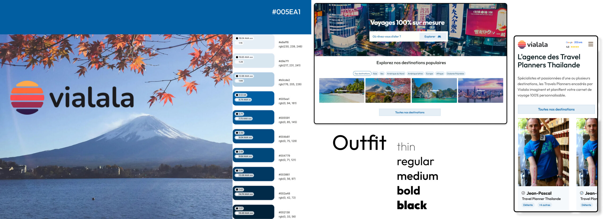
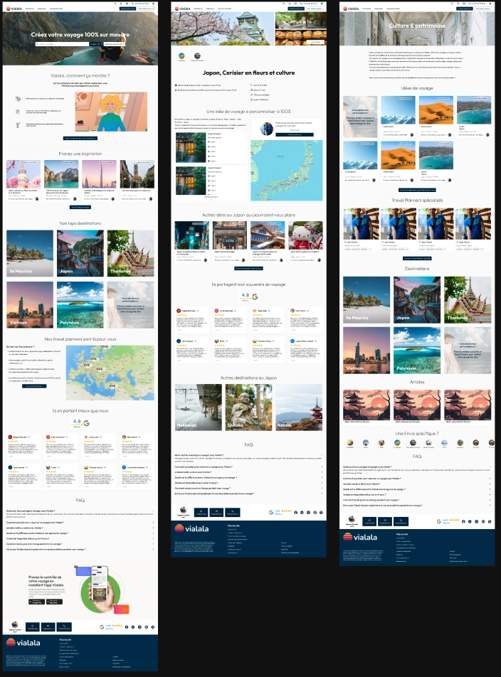
The goal of the new visual identity is to move toward a more refined and high-end look in order to better align with the core end user, with a focus on RGAA guidelines (accessibility).
_Intake form
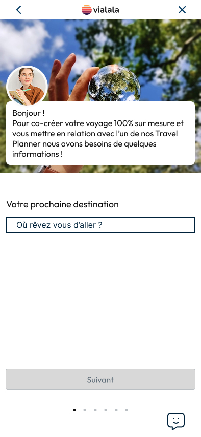
Viala specializes in offering personalized travel guidance through dedicated Travel Planners, it was essential to make this human connection more explicit and immediately recognizable.
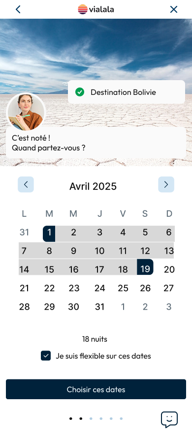
_Website navigation
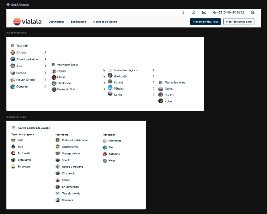
The primary objective is to provide a clear and detailed subnavigation for all available destinations.
Additionally, I’ve highlighted travel inspirations categorized by theme, season, and traveler profile to enhance discoverability and personalization.
_User testing
Given the tight timeline, user testing was conducted iteratively throughout the project.
A small group of potential Vialala clients participated in both moderated and unmoderated usability tests, as well as targeted surveys.
This agile approach enabled rapid feedback loops, allowing for quick adjustments and helping to minimize personal bias in design decisions.
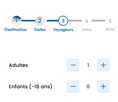
For example, the stepper initially included in the intake flow was removed, as it proved to be distracting for users and didn’t solve the dropout issue.
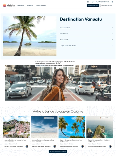
Another example involved handling destinations with no available content — such as Vanuatu, which had no travel ideas or associated planners. BUT Vialala could organize your perfect trip there.
Rather than displaying an empty or incomplete page, we chose to exclude these destinations from the navigation to maintain a seamless and high-quality user experience.
